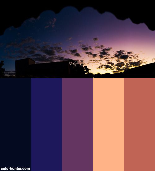

Choosing colors that clash is a powerful design strategy that can create visually stunning results. It’s not about throwing colors together haphazardly, but rather understanding how opposing colors can enhance each other’s presence. Color theory provides a framework for achieving this delicate balance, empowering you to craft compelling visuals that grab attention and communicate your message effectively. Many designers struggle to effectively use clashing colors, leading to a visually unappealing result and failing to attract their target audience. In this comprehensive guide, you’ll unlock the secrets to choosing colors that clash harmoniously and understand how to leverage this principle to create stunning and captivating visual designs. This article will outline several methods to achieve color harmony, provide you with illustrative examples, and give you practical guidance to improve your design choices, ultimately boosting your brand’s appeal.
Understanding Color Theory
The Fundamentals of Color Harmony
Color theory is the foundation of any successful color palette. It encompasses a set of principles to guide your color choices, enabling you to achieve aesthetic harmony and avoid visual disharmony. This involves understanding the color wheel, recognizing different color schemes, and understanding how colors interact with each other. Familiarity with the color wheel—a visual representation of colors and their relationships—allows for the identification of complementary, analogous, and triadic colors. These are foundational concepts that help you create a cohesive and visually compelling color palette. Understanding color harmony is essential for achieving a balanced aesthetic, whether it’s for creating a logo, designing a website, or even choosing clothes.
Embracing Clashing Colors
Exploring Complementary Color Schemes
Complementary colors, positioned opposite each other on the color wheel, offer a high-contrast effect. This contrasting nature can create a vibrant and energetic design, drawing the eye and making your brand stand out. A good example is using red and green, or blue and orange. These clashes, when thoughtfully implemented, can be visually appealing and create a dynamic visual aesthetic. Careful consideration of the saturation and intensity of each color is crucial to avoid the palette seeming overly jarring, resulting in a design that is both exciting and balanced.
Analogous Color Schemes
Analogous colors are those that sit side-by-side on the color wheel. They share similarities in hue, creating a harmonious and cohesive visual effect. Utilizing these colors can result in a relaxed, aesthetically pleasing design, drawing on natural color palettes. While not as bold as complementary schemes, they can provide a subtle and engaging aesthetic. Consider using shades of blue, green, and teal for a calming effect, or shades of orange, yellow, and red for a warm and inviting design.
Creating Visual Impact with Color Contrast
Highlighting Key Elements
By using contrasting colors, you can emphasize crucial elements of your design. The use of contrasting colors effectively draws attention to specific design components. A good example of contrast is using dark text on a light background or vice-versa. Consider using a bold color for a call-to-action button on a website, or using a complementary color for a logo to ensure it stands out from the background. By consciously utilizing contrasting elements, you can guide the viewer’s eye, thereby achieving a more engaging and targeted design.
Choosing the Right Color Palette for Your Brand
Aligning with Brand Identity
Choosing a color palette is crucial for branding. A company’s brand identity is largely communicated through its color choices. This should be aligned with your company’s message and values to create a consistent and lasting impression. This involves understanding how different colors evoke different feelings and emotions. A brand’s color palette should align with the overall tone of the company; for instance, a technology startup might use sleek blues and grays, while a food company could leverage warm yellows and reds. This alignment directly contributes to attracting and retaining the target audience, creating a strong brand identity that connects with the audience on an emotional level.
Practical Application: Designing a Website
Creating a Visually Appealing Layout
Consider how a website design can effectively use clashing colors to enhance the user experience. The visual hierarchy of a website can be profoundly affected by the interplay of colors. Using a color scheme that enhances usability can greatly improve the website’s functionality and make it more inviting to customers.
Additional Considerations
Balancing Intensity and Saturation
The intensity and saturation of colors significantly influence the overall visual effect. A carefully balanced intensity and saturation levels can create a design that is both visually appealing and emotionally engaging. Too much contrast can be jarring, while too little can result in a lackluster and boring design. The key is to find the right balance between these elements, depending on the message you’re trying to convey.
Resources for Further Learning
Useful Tools and Websites
Explore various online tools and websites to expand your knowledge and comprehension of color theory. These tools and websites provide color palettes, visual aids, and educational materials to enhance your understanding of color theory.
Conclusion (alternative)
In conclusion, choosing colors that clash can be a surprisingly effective way to create a visually captivating design. By understanding color theory and practicing the principles outlined in this article, you can confidently select color palettes that resonate with your vision and attract your target audience. Remember to consider your brand identity and the overall message you aim to convey. Experimentation is key to discovering harmonious color combinations, so don’t be afraid to step outside your comfort zone and embrace the unexpected. Now, go forth and create stunning, harmonious color palettes that leave a lasting impact!